Agree with these, but in my opinion, the date selector wheels in iOS are a terrible design. Three rolling wheels just doesn't map to most people's concept of a calendar
Agree. I would rather try my luck tapping a too-small calendar date as pictured on the right. I'll often get it right the first time, but even accounting for the extra time of an error and a retry (2 extra taps) it will still be faster and less frustrating than setting 4 separate scroll wheels.
What I absolutely hate is minute picker. 60 items is just too much to scroll. For most usages 5 minutes step is enough and 12 items much better.
As for calendar, I never had any problems with it. Of course it's not standard way that most people get used to, but I think any person will understand what to do.
That's a perfect example of "Apple thought of everything" except how well that feature is hidden from the user. I mean, who was the first person to discover that? And I'll bet money it was by accident.
To get simplicity sometimes you have to remove features, sometimes there's no way around it.
When you face the choice, to hide a feature instead of removing it altogether can be a good compromise. So it can be still discovered casually, it can spread by the word of mouth, blog posts, and of course the user manual.
When selecting text, would you, for example, put select-word/select-line buttons everywhere a text can be selected or just let people discover what triple click does?
The topic is debatable, I just wanted to say that this kind of choice does make sense to me, and probably many others.
100% in agreement with you. I can't remember the last time I needed to add a time with more granularity than 5 minutes. And the iOS date picker actually [does allow for custom granularity](https://developer.apple.com/library/ios/documentation/UIKit/...) up to 30 minutes.
But I guess there is no easy way to accommodate for both those that do need 1-minute intervals and those who would rather have 5-minute intervals (without adding yet another UI element or yet another setting to toggle).
This is a great example of when it's more important to stick with a familiar interface (i.e. the calendar) than to go with something that is "designed for touch".
I would wholeheartedly disagree - I think this is a great example of where you should break from common desktop norms and provide something which is easier for a big stubby thumb to use.
Do you have a better example? I don't find the select diag's like in Desktop Chrome easier to use especially on a mobile. I think what they've done is better than anything else I've seen. With enough following it'd become the norm like anything else.
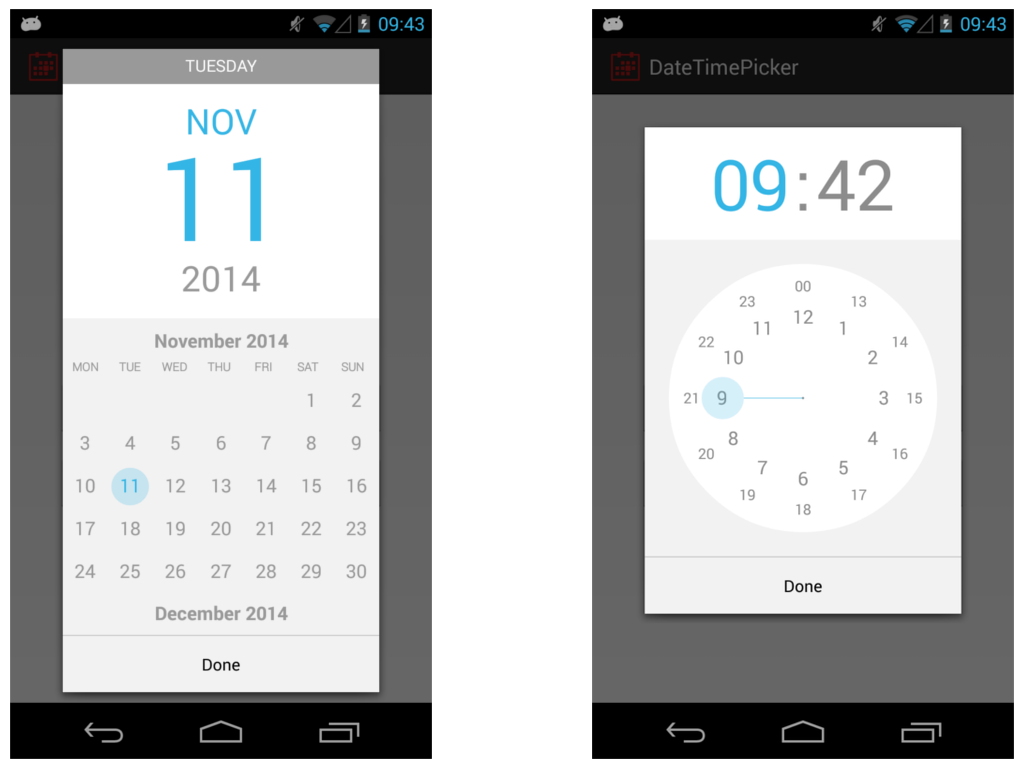
Android has a simple calendar which you can swipe to change the month. Click on the year and a year selection is shown.
The time is a clock where you're able to select the hour first and minutes thereafter. This is the most intuitive mobile touch interface I have seen so far, any other is really small, awkward or not mentally easy to comprehend.
>> "The time is a clock where you're able to select the hour first and minutes thereafter. This is the most intuitive mobile touch interface I have seen so far, any other is really small, awkward or not mentally easy to comprehend."
Really? This is incredibly unintuitive in my opinion. That clock was my biggest annoyance with Android and I always selected the wrong time first go round.
I just see it as pointing where I'd like the hands of a clock. The only learning curve I had is the difference between 10:00 and 22:00 (or likewise, between AM and PM).
You wouldn't want to do that in Things (it's a todo app) - you're most likely not going past next month, at the most. You're right though - this wouldn't be a good replacement calendar picker for every app.
Personally I love them. I hate when apps put in their own calendar control. It's always more time consuming to get where I want whereas with the wheel I can quickly spin it to move to where I want quickly.
Apple has been a driving force for better UI in a number of areas, but some of their choices are baffling. Even in this page, the "Contrast" section uses a large black header, but a small grey font on a white background for the content. Who chose Shift-Command-] for switching tabs in Safari? Why include the power switch in the keyboard, which makes it challenging to clean? Could their glossy displays be any more reflective?
I also feel like iOS has gone downhill. I know they were trying to get away from skeuomorphic design, but I feel they went too far in the opposite direction. Everything is flat, it's hard to tell what is a button that can be clicked on sometimes (usually it's just a blue label with no distinguishing background), and there seems to be a frequent lack of contrast generally.
I've never fully embraced Apple's view of flat design for that reason. I feel buttons should resemble something that looks like it can be tapped on, and that that is not against the current aesthetic of iOS (e.g., http://ipadportfolioapp.com/images/overview/Customization_2x...).
Yeah, also I feel the rainbow colours with a Gaussian blur looks pretty dated too - reminds me of Aero Glass. Android at its best looks much nicer, though it can be very inconsistent, even within Google-developed apps.
AeroGlass looks still very nice and fresh in Windows 7. Windows 8x/10 theme is too flat for a desktop OS and the color choices imo plain ugly. Microsoft removed most of the complex transparent effects because the Nokia/MS WinPhones 7-8 devices were too slow to handle them, that's why the desktop has to suffer as well. The iOS 7-9 and OSX themes have a lot better colors.
Grey text on a white background is generally accepted as easier on the eye/mind when reading sentences, whereas on the header it is not necessary, it's just one word, there is no train of thought to follow there. This would be considered good UX [source: I don't have anything to link to right now, but I do have a degree in Interaction Design]
The rest of your points get top marks and I hope to Cod that someone at Apple is listening. The power button on the keyboard is retarded (no other word for it, sorry), super glossy screens so you can't even see it in your own house.
As for Apple shortcuts, well, many make perfect sense and this isn't something anyone else does better. MS Word even changes them depending upon system language, so Word in Norwegian uses Ctrl+F for "fett" or bold. Imagine how annoying that is when someone asks you for help.
It happens at application level too, especially with non-US keyboards, just press ctrl+[ to access this feature, and no you cannot remap the shortcuts. Well, dandy, I can't access [ without pressing 2 other keys already. So I'll just press the X in the corner instead.
> Grey text on a white background is generally accepted as easier on the eye/mind when reading sentences
That may the single most propagated unfounded myth in UI design this decade. [1] While it's true that pure black on pure white causes problems for some dyslexic users, there is also a _minimum_ required contrast [2], which is routileny ignored by many "stylish" web sites.
The plague of contrast-less "light grey on white" have been adopted by plenty of "web 3.0" sites out of following fashionable trends, to the point of making them unreadable.
I've been forced to place a "Contrast" bookmarklet on the toolbar of all my browsers to fix all those terrible contrast-less pages I found everywhere, and I'm forced to use it dozens of times a day to alleviate my aching eyes. (Hexadecimal #333 is my personal upper level of comfort on white backgrounds, anything above that begins physically hurting my eyes when reading any kind of long text).
Notice I said grey, not light grey. Good designers will understand that there has to be a contrast between the background and the foreground. There will always be some who misinterpret the rules.
The first site you linked could exist for any design principle found on the web, just change the pattern to fit. The example they give also has negative text-shadow (engraved effect). That is not evidence of anything. Anyone could make a website with focus on a single design error like that.
The W3 link doesn't support your argument either, as all they are saying is to make sure there is enough contrast, not that grey text is wrong. They also include "provide sufficient contrast when viewed by someone having color deficits" in the title, which I took to mean people with impaired sight. IF you want to go down the rabbit hole that's is more than 1% of the www friendly toward people with accessibility problems you will be lost in there until rabbits evolve to live in houses.
Think of the kindle, is that black text on a white page? Now search for why people like e-readers over tablets, you will see that black on white is not good for the eyes.
> There will always be some who misinterpret the rules.
Right, though the problem is when the misinterpretation takes on a life of its own and it's propagated as a good practice, as it happened with light grey and its purported benefits to dyslexic readers. This practice is too widespread to be left unadressed without correction.
As for e-readers, the newer models of the Kindle and other competitors have darker text over whiter background as a selling point, and the early grey-on-grey was touted as a huge limitation of the format. I've tried both and I clearly prefer the high-contrast versions.
Also, people prefer e-readers because they are based on reflective light instead of emiting LEDs - it has nothing to do with them having grey text.
I, too, have problems reading many websites that insist on using light grey. Perhaps off black would be better to read but the misuse of grey text has a real world effect on people who are older and/or people with bad eyesight. Off black and grey aren't the same thing. I am baffled by designers coming in and discounting the people who say "this is hard to read for me" with "no it isn't."
For me, I open up firebug and change the text to black. It is amazing how often I can't read something some "designer" thought looked good with a complete disregard for functionality.
I am wondering (serious question) if grey on white is so easy on the eyes why are all books (as far as I'm aware) published with black text?
One of the web's greatest problems has been defining itself in relation to printed media. From use of font types, colour and page layout, margins and line spacing, the web is not on printed paper. Why do you think the two are the same?
I am not disputing that there is a lot of bad design out there, one of my personal peeves is tiny text. I've seen real UX people use a 9pt font because it looks good on their screen, but is impossible to read on anything else and when you don't hold your face 4 inches from the glass.
I've said this before and I'll say it again, one of the problems with UX is the number of "experts" who are self-taught. It's like web-design/development circa 2001, everyone was claiming to be a "web-dev" but in practice hardly any could do more than basic html & tables. UX, imo, is like that now.
I do not. I was asking a question that if we have become enlightened because of digital media why hasn't some of those best practices translated back to traditional media? Maybe they have, I don't know, I can't recall noticing. If off-black is done well it isn't noticed because it doesn't look jarring anyways so perhaps we are all reading off black books. Not really sure. It was just an inquiry.
Feeling a bit confrontational today are we? Call it what you will, but this is "generally accepted" which means exactly what it says. You seem to have confused "this user's opinion" with "what the textbooks say". Still, I'm open to hear about all the UX books you have read.
You don't need to read a textbook to see users complain about it, or to know that I go out of my way to fix low-contrast webpages to make them easier to read. Poke around elsewhere in this thread. Check out <http://contrastrebellion.com/ >.
That's the same link I debunked earlier in this thread. Just because someone made a website about something does not make it a real thing. I know there are a lot of sites that do text wrongly, not just colour, but size and font too, but they don't all need a movement.
Most likely, that shade of grey was chosen precisely because the section headline is black. If both were black, it would compete with the typographic hierarchy, making it distracting to skim the entire page.
Good design is a form of engineering. You have a set of principles and successful patterns– such as the ones on the linked page– but your job is adapting to real world constraints. In this case, the challenge is making a headline look like a headline only relative to the example, not the page.
As far as the Safari tab shortcut, that's consistent with the rest of OS X. How did they originally arrive at that shortcut? They probably tried several combination, all within reach of the home keys, and that felt most right.
Why include the power switch on the keyboard? I know every user's first question is "where is the on switch?" and that position seems highly visible, and it can be consistent across all macs. In my entire history of using Macs, I've never had an issue cleaning the power key.
No idea why they made the displays more reflective. But given their overall attention to detail, a lot of thought probably went into it.
Nobody visits the developer portal on mobile devices. I know I don't browse reference docs on my phone since I can't run Xcode on it, so that's probably why they haven't optimized for mobile yet.
OS 10.9 and iOS 7 have taken contrast and thrown it out the window. They are both following current designer trends of less contrast overall while claiming better readability. The low contrast trend started around 2011 to 2012 with web sites. It typically takes Apple one year to catch up with the trends on their operating system releases.
Both their recent releases result in more eye strain for me looking for a way to fix their messed up ideas of contrast.
Do you suppose that this might be related to the oft-discussed-on-HN ageism that the Silicon Valley-based industry is accused of?
Low contrast may be pleasing to twenty-something year old eyes, but unreadable to fifty-something year old eyes, and, if I consider my own attitudes and thinking at a younger age, I would almost certainly not have been considering how UI design choices would impact people with less-than optimal vision but for a mother-in-law with severe vision limitations.
It could have a minor bit to do with relative age of the designers, but I would assume it is more do with current designer trends. Personally, I do not wear glasses and have considerably good vision as well I even go to the extent of using good monitors with IPS panels that are properly calibrated. Even then there are issues with font contrast in OS 10.9 and iOS 7 where they decide to use a white font with a very light drop shadow.
I have always made sure to design with disabilities in mind.(Section 508 government work.) There was a previous designer I worked with a couple years ago that came from the Silicon Valley area that would require a weekly reminder that low contrast designs would not be acceptable.
Well, good design is obvious once you know it. But before you know it, it's as opaque and obtuse as anything else. It's just that design has this strange property with us humans in that, when done right, it feels so natural and emergent to us to the point we automatically take it for granted the instant we "get it".
In the realm of modern-day web-design, most bad design is because the website was built before a lot of these good design principles and conventions were invented (e.g. responsive grids, tons of padding, flex-direction(column), etc.). Next followed by prideful "designers" who steadfastly refuse to use a design framework because the site they're building must be a special snowflake. Next followed by the missing-the-point-followers of RMS (that is, they're not following RMS for the free software philosophy) who plainly look down on CSS and design as something that is beneath them. Finally, I'll give you laziness.
Most of the stupidly bad design decisions I have seen come from somebody high in the hierarchy (product manager, CEO or founder) demanding a change, even if both designers and developers rally on how awful it would be.
I have not yet found a solution to this problem.
The book Articulating Design Decisions (O'Reilly) deals specifically with this. It's always an uphill battle, and the book's overall lesson is "empathize as much as possible", but it's a great read. It has definitely helped me in dealing with more difficult management types who don't understand the design or technical side of product building.
Hey there, I wrote Articulating Design Decisions. Convincing stakeholders of your decisions is critical to the success of every project for sure... I've been there many times.
You can watch my talk from MidwestUX last year that gives some practical tips too: https://vimeo.com/110260257
The early release eBook is available now. The print version will be available in August.
I don't think so.
It would certainly help in some specific cases and some ideas are certainly worth testing out.
However :
-A/B testing can only answer some very specific questions. Good UX is not just measured by engagement.
-some of these decisions are just bad practices that are widely recognized : for example we were asked to add modal popups pretty much everywhere.
-we are severely shorthanded and implementing these changes and the A/B tests can be a very significant time investment. Especially when they are abandoned before going live for the reasons given by everyone but the person in charge.
Think of the eternal vastness of configuration spaces (even in domains as restricted as, say, static HTML/CSS pages) and then you know why AB testing is not a solution to everything. (Multivariate testing, too. It’s just slightly more elegant in some respects, but suffers from the same basic deficits and additionally has its own issues.)
Time is limited and traffic is limited. You simply cannot test everything, in fact, the amount of variants you can actually test during, say, a year may be shockingly low compared to the amount of variants possible (at least if you are not Google – but most aren’t).
Without a strong sense of direction and discerning eyes and hands that provide plausible variants to test, AB testing can be quite useless. AB testing is a great tool to verify hypotheses (and those may well be competing hypotheses), but I really question its usefulness as a creative tool.
If you can plausibly only do a couple of AB tests a year (the possibility of running an AB test being a function of traffic and time) you better not waste that opportunity on button colors or some similar nonsense.
Sure, evolution through natural selection produced some awesome designs and is basically a completely blind process based purely on testing of different variants with only slight and random differences with no involvement of any designer at all (sound familiar?) – but it also took billions of years. Most designers just don’t have that kind of time …
To more directly answer your question, AB tests can certainly be used to defend against bad hypotheses. If there is a culture of testing and new designs have to be battle tested then that’s less of an opportunity for someone in a position of power to screw things up by fiat. However, that’s also a tremendous waste of time and efficiency if bad designs that could be sieved out quickly by simple heuristics have to also first be tested, which is just a slow process and a wasted opportunity to test something better.
Maybe think of AB testing as a last line of defense, but be careful, AB tests can be paralyzing. (Or rather, first AB tests paralyze everything, then the boss is annoyed by how slow everything is going and changes everything by fiat and immediately without any testing at all. From one extreme to the other …)
I'd find it more forgivable if it was laziness, but I've seen too many cases where designers put in extra effort to make things worse to believe that. I think it's ego. Good design is about doing what the users want rather than what the designer wants; bad design is the reverse.
I agree that most of them are obvious. I don't agree that bad design is because of laziness. There are many reasons for bad design and most of the time I'll only find one or two of the "dont's" in a given app, but this will ruin my experience. Case in point: I can't even count the number of HN readers I deleted because they didn't display the content without vertical and horizontal scrollbars or had really small text. Everything else was fine though.
I don't think the reason is any need for research. There have been quite a few occasions when I've made suggestions regarding how to fix obvious, major flaws. I've stopped bothering, because the response in all cases has been - not "sorry, we don't have time to implement the fix," which would be entirely forgivable, but some polite variant of "no, this is our product not yours, so we'll do things the way we want, not the way you want, so get lost."
On the bright side, that means if you are willing to set ego aside, you gain an immediate and substantial advantage over the competition.
There's such a thing as just-in-time design, where you only put as much effort (money) into it as it deserved. All rom-upgrade utilities look like suck, because, well, you only use them once and they're free. And so on.
Agreed completely. This is all Design 101. I'd worry about someone who was employed as a UI Designer who did not already understand all this inherently.
Without being there at the time the decisions are made, a lot of it appears to be laziness to someone looking from the outside.
It could be laziness, but a lot of times, I found that it was time constraints to deliver and fix it later, but later never comes or it's not important enough to revisit and change.
Their "contrast" section belies their determination, since the text there is grey on a white background, and true black on white would unquestionably be more readable. (looking at UI designers more generally:) I'm so sick of UIs that have repetitive, huge, contrasty, readable headings... only to have the core useful text be grey-on-something, tiny, possibly italic, and so on. Idiots, and they are legion. More subtle issues like older folks having lower visual resolution, and many folks (men mostly) having significant color blindness, never seem to occur to UI designers as a problem.
Black on white is a hand-me-down from print that made it's way to web without anyone giving it much thought. It is indeed too great a contrast for back-lit screens. Google results also show the page descriptions using grey on white. Surprising that so few people know of this.
Back in 1999 the Interface Hall of Shame did a takedown on the Quicktime 4.0's interfact - and noted it violated Apple's own human interface standards. Worth a read. http://hallofshame.gp.co.at/qtimeno.htm
(I also saw irony in a page with poor color contrast telling you to avoid poor color contrast)
They're all guilty and they should all be hanged, only today I was asked to set up 2-step auth for a Google account and I see that Google are still using "ex" to mean example for telephone numbers. For those of old enough to remember this looks awfully like the old "ext." meaning extension. Since when did "eg." become too hard for people, it is the established abbreviation for example in English. The only reference i could find to "ex" outside of google was a wiki-something page using it. Is this something I should have been made aware of before now in my decades long life?
"Blurry" is not what most people would perceive. They won't perceive a problem with the site at all and in most cases will never notice or care.
Sure it's nice to use hi-res images, but I prefer using just one image that is slightly higher resolution than normal... maybe 1.5x and then increase compression. The result is noticeably better, satisfying the perception of "sharp" but still uses just one image and often only a very small increase in file size.
Delivering two versions of the image for all your regularly produced content is an inefficient practice relative to the benefits IMHO.
What advantage is there to shipping a single asset?
On the web, use the "srcset" attribute on img tags. If the device supports @2x, it'll fetch the right version.
On an iPhone app, any advantages are far outweighed by the headaches of resizing "@1.5x" assets for each device resolution.
Now consider the iPhone 6+, which has @3x resolution. At 1.5x it feels blurry.
But forgetting that, would @2x users notice? They won't be able to articulate something is wrong, much like if you pick a suboptimal line height, they won't be able to articulate "it's less legible." It's all these little things, combined, that make a project feel amateurish.
I suppose this article is about iOS apps, so I should stay away.
Nobody is "shipping" anything on the web. I've never understood the use of the word, even for apps. Something that is shipped cannot be touched or modified after release. This isn't the case on the internet.
For the normal operation of a website, needing to make only one image per product item is obviously more economical for whoever is making the content, not to mention the technical hassle faced depending on your CMS and how it handles image assets.
Making the image slightly more hi-res, say 1.5x, and then compressing it more aggressively has the benefit of satisfactory sharpness and quality on high density displays, while compressing to a size similar to the low res. I've confirmed this and use this technique, as others have.
For example instead of the normal 800 pixel wide product image, you make it 1200 wide but compress it more when making the jpeg, say 55 instead of the usual 70. The result is a nice lean and sharp image without the bloat of a "2x" file size, and without any perceivable quality loss from increased compression. The increase in resolution serves to hide the compression artefacts surprisingly well.
I'm talking about responsive of course, so there is no fixed width specified in the tag.
iPhone 6 has 3x res? So what? It's an iPhone with a physically small screen. People hold those screens in their hand - arms length from their eyes. You won't see any difference between a 1.5x 1200px wide jpeg photo and a 3x 2400px wide image on that screen. Not until you get your magnifying glass out, or pinch and zoom will you see a difference.
Not a fan of "srcset", it's not well supported and promotes a clumsy multi-res production workflow, which isn't needed for regular jpeg content images on the web - the point I'm getting at.
> Nobody is "shipping" anything on the web. I've never understood the use of the word, even for apps. Something that is shipped cannot be touched or modified after release. This isn't the case on the internet.
At minimum, expect one week of review time before you can release an app on the App Store.
As far as web apps, every line of code that makes it to production has consequences. If you make a catastrophic mistake, like leaking user data, how long does it take to 1) discover the mistake, and 2) deploy an update? If you're dealing with thousands of servers and multiple data centers, it can take an eternity.
> Making the image slightly more hi-res, say 1.5x, and then compressing it more aggressively has the benefit of satisfactory sharpness and quality on high density displays, while compressing to a size similar to the low res. I've confirmed this and use this technique, as others have.
Did you perform user research? Are you a designer? Or does "confirm" mean, "my opinion"?
> For the normal operation of a website, needing to make only one image per product item is obviously more economical for whoever is making the content,
Whoever is making the content should have this automated. If they can't, your job as an engineer is to automate it.
> not to mention the technical hassle faced depending on your CMS and how it handles image assets.
1. Are you writing this from 1992? What modern software can't handle images at 1600 resolution?
2. Your CMS shouldn't have any load. Your assets should be delivered by CDN.
> iPhone 6 has 3x res? So what?
Users feel something is off, whether or not they'll articulate it. All these little things, together, make your website look amateur.
Do they? Because an image is 1.5x and not 2x on their phone? Mate, that's nonsense.
Just do a comparison yourself and you'll see. I did, checked and confirmed with the client (jewellery designer where the image quality was important) and they were happy. On my iPad3 the 1.5 product images (at 1200 pixels wide presented half width of screen) were MORE than adequate and very sharp on the iPad. No "blurriness" at all. There is no way in the world you'd be able to tell the images were not 2x when the screen is viewed at normal distance.
> "Are you writing this from 1992?"
I'm writing this from the real world. In your utopia it seems everyone has unlimited bandwidth on their mobiles to download 1600px images for every product listed, and can see the difference with their bionic vision. I prefer to keep site weight down and enjoy the increased performance as a result.
Disagreeing is fine, but your argument amounts to "the site will look amateur hmmkay", and I'm telling you now that the "amateur look" comes from poor UX or clunky design and performance, not whether an image is 1.5x vs 2x.
Using a CDN for assets is good, but not always an option/need for a small business website with minimal traffic (such as a jewellery designer's e-store) and keeps the dev costs and complexity down if everything can be handled on the one platform. But I don't disagree with you about using a CDN, it's just that a CDN doesn't suddenly make the frontend more responsive or snappy. Those images still need loading in the browser no matter where they come from.
I convince my clients to spend a little bit more on their web host account, to get a bit more CPU performance and memory so that uploading images and so on runs smoothly. Works for me, works for them. Whether it works for anyone else is not my problem! I'm just sharing my approach. Ignore or disagree, it's all good.
Good luck. Remember to do things because they work in practice, not because Apple or Google or some random person on HN said to do it that way.
I feel like this is a poor attempt to try and craft some cohesion in the app store. Google has done a much better job of writing guidelines with their Google.com/design site, specifically the Material Design Guidelines[1]. In my opinion, Google has really shown that it has a stronger design sense than people give them credit for.
Apple's watch UI document is there, too. That's interesting. Apple has very tight control on the watch interface. Apple owns the knob and the button; you can't use those. You must use white text on a black background. You can use only one font other than Apple's "San Francisco". Voice input is not a watch UI component; voice input appears to be reserved for talking to Apple's Siri.
Android be like, press anywhere on the row to check the box on the right. And anywhere on the row to go to the next page in the menu. And anywhere on the row to do nothing, but press the arrow all the way to the right to go to the next page. Android be liek: we didn't think this through. At all.
Not defending some of the choices Apple make, but if you want to get into an old-style flame war of Apple UX versus Android / Win / Linux / anything, you better come with a better argument than that.